
Oracle APEX (Application Express) makes it simple to visualize project timelines using Gantt charts. These charts are powerful tools for project tracking, resource allocation, and scheduling. In this blog, we’ll walk through a step-by-step tutorial to create a Gantt chart in APEX — complete with a flow that mirrors what you’d see in the interface.
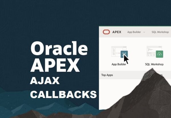
🟢 Step 1: Create a New Page
- Open your APEX App Builder.
- Select Create Page → Chart → Gantt.
- Give your page a name, for example: Project Timeline.
👉 At this point, you’ll see a wizard prompting for your data source and chart attributes.
🟢 Step 2: Define the SQL Source
In the wizard, add a SQL query like this:
SELECT task_id       AS id,
       task_name     AS label,
       start_date    AS start_date,
       end_date      AS end_date,
       progress      AS progress,
       null          AS dependency
FROM project_tasks
task_id: Unique identifier for the tasktask_name: Displayed label on the chartstart_date&end_date: Define the bar on the timelineprogress: (0-100) shows completion percentagedependency: Links tasks (optional)
👉 The wizard will preview your data to confirm the mapping.
🟢 Step 3: Map Chart Attributes
In the wizard, map your SQL columns:
- ID →
task_id - Label →
task_name - Start Date →
start_date - End Date →
end_date - Progress →
progress(optional)
👉 This ensures the Gantt chart knows how to plot your data.
🟢 Step 4: Customize the Display
Navigate to Attributes → Timeline Options and:
- Choose Granularity (Day, Week, or Month)
- Adjust Bar Colors (e.g., based on task status)
- Enable Progress Bar to show completion inside each task bar
👉 A preview window updates to show how your changes look.
🟢 Step 5: Add Interactivity
Make your Gantt chart more engaging:
- Dynamic Actions: On Task Click → Show a modal dialog with task details.
- Conditional Formatting: Highlight overdue tasks with SQL logic:
CASE
   WHEN end_date < SYSDATE THEN 'red'
   ELSE 'green'
END AS bar_color
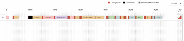
👉 Tasks with missed deadlines will now appear in red.
🟢 Step 6: Run & Test
- Click Run Page to launch your chart.
- Scroll through the timeline, zoom in/out, and hover over tasks for details.
- Validate that tasks display correctly with progress and colors.
👉 Now you have a working interactive Gantt chart.
📊 Why Use Gantt Charts in APEX?
- Project Management: Track timelines, milestones, and dependencies.
- Resource Planning: Monitor workloads across teams.
- Production Scheduling: Visualize manufacturing or delivery schedules.
- Training/Education: Show course or module timelines.
Step 5: Use Cases
- Project Management: Track software releases, marketing campaigns, or product launches.
- Construction Planning: Visualize tasks for multi-phase construction projects.
- Team Coordination: Assign tasks to team members and monitor progress.
- Resource Allocation: Identify task overlaps and avoid overloading team members.
Best Practices for Oracle APEX Gantt Charts
- Keep data clean and consistent: avoid missing start or end dates.
- Use clear labels and colors to distinguish statuses.
- Combine Gantt charts with interactive filters to allow users to focus on specific tasks, teams, or phases.
- Regularly update and maintain the underlying tables for accurate real-time visualization.
🎯 Conclusion
Creating a Gantt chart in Oracle APEX is straightforward if you:
- Prepare your SQL with start and end dates
- Map columns correctly in the wizard
- Customize colors, granularity, and interactivity
With just a few steps, you can turn raw project data into a visual timeline that improves planning and execution.
💡 Start small with test data, then enhance your chart with dependencies, colors, and dynamic actions to make it more powerful.